Close
WE'RE ALL ABOUT
YOUR
SUCCESS
HOW WOULD YOU LIKE TO GET IN TOUCH:
Email
Email
Calendar
Cal
Close
WE'RE ALL ABOUT
YOUR
SUCCESS
HOW WOULD YOU LIKE TO GET IN TOUCH TO SCHEDULE YOUR DEMO:
Email
Email
Calendar
Cal
Mapline - mapping made powerful Close
Give us a call. We'd love to talk!

+1 800.969.1454

Close
Close
Geo Mapping Starter Close

Experience the power

Get ready to see your data in a whole new way!

Mapline Blog

Tune in for new updates, tips, tricks, and news about Mapline!

Mapline vs. Google Maps: GIS Maps for Your Business

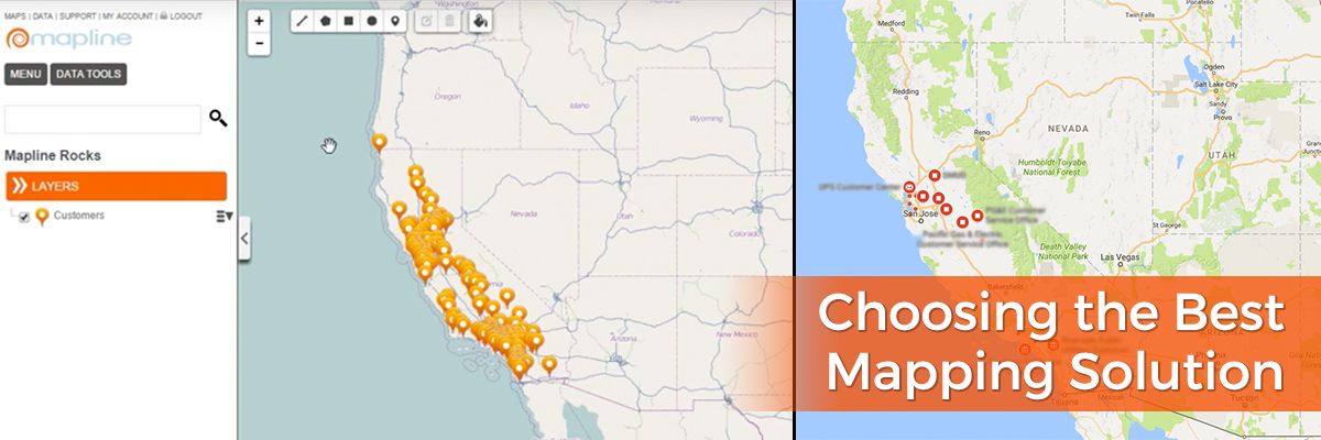
Google Maps is the go-to mapping software when it comes to getting driving directions, and that’s great if you’re planning a family road trip. But when you’re looking to visualize and analyze data for your business, is Google still the best service to turn to? We take a look at the features of both Google Maps and Mapline to show Mapline’s superiority when it comes to mapping software for your industry. Plotting Multiple Locations Google Maps: Sure, you can plot multiple locations within Google Maps – as long as all you want to see is how to get from one to the others. For distance between several points, you need to enter in each starting address and destination address, note the distance, and then start over for as many data points as you need. Mapline: With Mapline you get the whole picture. Upload your Excel sheet with hundreds of locations and view them simultaneously as pins on a map. Easily visualize the distance between any of the addresses while still being able to see each of your pins and take in the big picture.

Data Analysis

Google Maps: Google offers no analysis of your data. Aside from determine exact driving distance from one point to another, you’re unable to draw any conclusions from entering addresses into Google Maps. Mapline: You can obtain a wealth of information from viewing your pins in Mapline by using our features such as sublayering, radial mapping and territories.

Sublayers

Use Mapline’s sublayers to group your pins according to customer segments, location types or other differentiators. The color coding of sublayering lets you quickly see patterns and trends in your data such as clusters or outliers. There is no equivalent feature in Google Maps.

Radial Mapping

There are two radial mapping options within Mapline: Areas Around Pins and Overlapping Radius Areas. The first allows you to view high-density pin clusters as well as high-value pins, based on data amounts included in your Excel spreadsheet. The second radial mapping choice gives you the option to set a distance for the radius and will present a heat map around each pin, showing you where pin radii overlap. There is no equivalent feature in Google Maps.

Territories

Mapline’s territories feature offers dozens of existing territories that you can overlay on your data. Choose from territories delineated by zip codes, area codes, DMAs and so much more to put your data in perspective and understand the story it is telling. Google Maps does show state boundary lines, but only in relation to distance between two or more addresses.

The Bottom Line

We highly recommend you continue using Google Maps to plan your trip to your vacation house, but for everything business related, Mapline is the clear winner for GIS maps.

Mapline Makes a Difference: The New Jersey Mock Election

We’ve been having some fun behind the scenes at Mapline this election season. We’ve teamed up with the New Jersey Center for Civic Education and the New Jersey Social Studies Supervisors Association to power maps for their mock election for students.

How the Mock Election Works

The mock election covers the presidential race, as well as New Jersey congressional seats and two “yes or no” issue questions: whether the state’s gasoline tax should be raised 23 cents per gallon to fund repairs and improvements to New Jersey’s roads and transportation infrastructure and whether term limits should be imposed for members of Congress. Educators simply determine their Congressional District and download the appropriate ballot for their students, who are then able to cast their votes either on paper or electronically. Voting opened October 10, and all results must be submitted by October 25.

Mapping the Results

After the votes are in, our Mapline team will power maps that will plot a variety of different data for students and educators. A total of 77 maps will be available as PDF downloads representing combinations of 4 overarching variables: candidate, issue, grade level and political region. Mapline’s territory heat map overlays will color code territories in order to differentiate voting patterns. In addition to the PDF maps, Mapline is also providing 4 aggregated maps to be embedded in the site that students and teachers can manipulate. These live, interactive maps will represent voting results across all grades by Congressional District. A map will be dedicated to each candidate and issue variable. Students and teachers can zoom in and out on these maps and can perform searches for specific cities or addresses to narrow down the data.

Increasing Civic Awareness

Students from grades 5-12 from more than 300 school districts in New Jersey are expected to participate in the mock election, generating a wealth of data on student political opinion. It’s a fantastic educational opportunity for teachers to show students firsthand how democracy works and to lead them in analyzing voting patterns across districts. We’re honored to be a part of such an endeavor, and can’t wait to see the results come in! Check out other ways Mapline can be used in the classroom and beyond.

Customize Map Labels with Images

Easily organize and distinguish pins on your map

Let your map tell your stories for you! Mapline enables you to upload images so you can create custom map labels. Easily add your company or customer logo and assign it to the appropriate locations. This is especially helpful when you have large data sets and it is hard to differentiate between all the different pins on your map. Sometimes colored pins aren’t enough to easily visualize your data with your team. By being able to upload your own images, you can easily distinguish between location sets when you plot pins on your map.

Steps to upload custom images for map pins

  1. Open your map.
  2. Click the pin icon in the left sidebar next to your dataset name.
  3. Select the “Custom Image” tab.
  4. Click “Upload.”
  5. Select the image you would like to upload. It can be any .JPEG or .PNG file.
  6. Once uploaded, click the same image to use as the marker.
  7. Choose the icon size.
  8. Click the “OK” button.
That’s how easy it is to add custom labels to maps.  Sign up now to give it a try!

2015 Mapline Voyage

We came, we saw, and  yes, we so conquered 2015 with flying colors! Thanks to all of you, our valued Mapline customers and users, because you made another mapping year with us truly awesome! 2016 is just around the corner – yup, another meaningful year peeking at a distance. But for now, we thought it would be nice to reflect back on some of the best accomplishments of Mapline for the past 365 days. 2015 Mapline Voyage Here are some of the ways you made the difference in mapping with us: These will not be possible without your continuous feedback and allowing us to help you achieve your mapping goals. What’s in store for Mapline in 2016? We can only expect better victories ahead for all of us. And we can’t wait for all that we have in store for this year. So bring it on, 2016!
How to Map Sales Territory Reports

Increase Visibility into Your Sales Performance

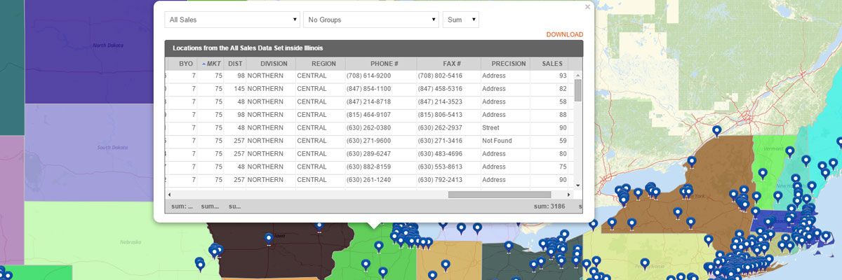
Sales territory reports provide full visibility into your sales performance you don’t get when looking at numbers in a spreadsheet. Sales summary maps created with our territory mapping software include:
  • Measurements – the shape of the territory, number of sides, area, and center coordinate
  • Summary of All Data – summary of all data sets inside the territory which include name, location count, midpoint, and center of minimum distance. If you have sales numbers in your pins, then you can see the total or average sales for each territory.
  • Export option – to download the territory report.

Steps for How to Create a Sales Summary Map

Creating a sales summary map is easy. Just build your map and place your sales data pins on the map. Then, overlay the territory you would like to view. To access the territory report:
  1. Hover your mouse to a specific territory and click it.
  2. Your territory report will appear.
  3. Click the “Download” link.
That’s how easy it is to see territory performance reports! You can also create a heat map of your territories to visualize the performance.

 Start Mapping Today

Segment Customers with Excel Data

Excel Mapping for Customer Segmentation Data

Customer segmentation has never been easier than with Excel mapping. By mapping with Excel data, you get a clear visual representation of information that was previously only available in spreadsheet format. With Mapline you can segment customers based on any data you have in an Excel spreadsheet. Let us give you an example. Let’s say you want to be able to segment and differentiate your customers based on which policy they buy. First you need to map Excel data. Once you have all your locations mapped, you can use the Segment tool to group your pins by any column from your spreadsheet. So, just click on the layers options and select the segment option. Then you can choose the Policy column from your spreadsheet. Done! You can see trends on where certain policies are being sold to help you segment your customers and enhance your marketing efforts. That’s how simple it is to segment customers by mapping Excel spreadsheet data. Market segmentation data can be invaluable for understanding what’s happening with your business and getting a leg up on the competition. Decide on the right plan and pricing for you and try it out for yourself.