Close
WE'RE ALL ABOUT
YOUR
SUCCESS
HOW WOULD YOU LIKE TO GET IN TOUCH:
Email
Email
Calendar
Cal
Close
WE'RE ALL ABOUT
YOUR
SUCCESS
HOW WOULD YOU LIKE TO GET IN TOUCH TO SCHEDULE YOUR DEMO:
Email
Email
Calendar
Cal
Mapline - mapping made powerful Close
Give us a call. We'd love to talk!

+1 800.969.1454

Close
Close
Geo Mapping Starter Close

Experience the power

Get ready to see your data in a whole new way!

Author: Mapline

Visualize Sales Territory Performance

Mapping gives you a whole new way to report sales territory performance visually. A territory heat map is the easiest way to visualize performance. Just paste your spreadsheet sales performance data into Mapline to show your customers or locations on a map. Then, you can easily overlay territories to your map to see performance by postal code, county, or state. Each territory will be colored according to the sales performance of all customers or locations within that territory. Also, clicking on a territory will give me a summary of all the included data. And you can easily export that back to Excel if needed. Alternatively, you can also use the Draw Pad if you want something super quick. Just draw a shape on your map that encompasses multiple sales territories. Then, you can click on the shape to see all the data for the locations inside the shape. You can then group it by Rep, Policy, Active or not, or anything else. That’s how easy it is to visualize sales territory performance in mapping. Sign up to get started!

Identify Growth Opportunities With Mapping

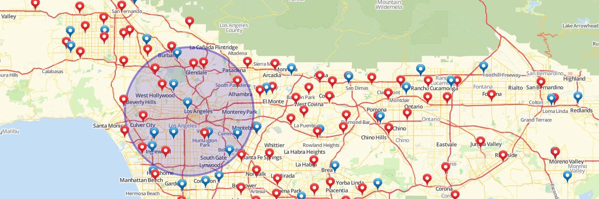
Mapping opens a whole new world when you need to identify growth opportunities for your business. Let me give you an example of how simple it is to make better decisions when figuring out where to grow. Let’s say you want to open a new Mexican restaurant, but you want to find the best location that isn’t near a competitor. Don’t get me wrong, I’m sure your food is pretty yummy, but I’m assuming you don’t want to fight with competitors if you can help it. Just paste your spreadsheet list of competitors into Mapline. Once they are on your map, you can use the Filter option to only show other Mexican restaurants. Now you can see your direct competitors and where they are relative to your potential locations. You can even add a 10 mile radius around each of them to see their network coverage. Then you would be able to identify a couple locations that could be HUGE opportunities with NO competitors! And that’s how easy it is to find growth opportunities with mapping. Sign up to start your analysis now!

Minimize Transportation Costs Using Mapping

Let’s say your transportation costs are too high. With Mapline, you can easily optimize your transportation costs by identifying the closest distribution center to your retail stores. Just take your Excel spreadsheet with the list of your store locations and the list of all the distribution centers. You want to find the distribution center that has the shortest distance to each store location. So, once these are pasted into Mapline, just select the Distance Calculations option. Now you need to pick the two data sets that represent the distribution centers and the stores. Once you hit download you will get a spreadsheet that shows the distances between each store and each distribution center. Now, using Excel, you can easily run a minimum formula to find which distribution center is closest to each of your stores. And that’s how easy it is to minimize transportation costs using Mapline! Sign up to try it out yourself.

Streamline Operations with Mapping

Mapline makes it simple for you to streamline operations by identifying backup supply options. Let’s say that you own some gas stations, and there are occasionally supply outages from your fuel supplier. You want to find some backup supply options so that your operations aren’t affected. This is simple to do with mapping. Just plot your gas stations and suppliers in Mapline. This can be added with a simple paste from your Excel spreadsheet. Once the gas stations and suppliers are on your map, just go to the Distance Calculations option and select these two data sets. Once you hit download you’ll get a spreadsheet showing the gas stations along the left rows and the suppliers along the top columns. Where the Row and Column intersects is the distance between the two points. Now that you have a huge distance grid spreadsheet, you can easily run a =SMALL() formula in Excel to identify the first, second, and third closest supply locations to evaluate your options! And that’s how you can streamline operations using Mapline! Sign up to start streamlining your operations with mapping.

Leverage Sales Territory Mapping for Your Business

Visualize Your Territories with Territory Mapping Software

Well-defined sales territories directly impact sales results. But how do you take the data you have and visualize it, so you can view your current sales territories and identify new opportunities? This is where Mapline’s quick and easy sales territory mapping feature can help.  

Territory Mapping with Mapline’s Drawing Pad

Let’s say your business has grown to the point where you need to restructure your sales territories so they can be more effective. There are two ways to build sales territories, and they are both super simple. The first way is to leverage the drawing pad to draw territories on your map. This is easy if there aren’t too many territories and you aren’t looking for perfection.

Create Sales Territory with Overlays

The other way to build sales territories is by mapping territory overlays. This method is best if your sales territories consist of groupings of zip code, county, or state boundaries, and you’d like to color each territory (such as zip code or county) according to the sales territory it belongs to. Let’s assume you’d like to do this with zip codes.

Steps for Sales Territory Mapping

  1. Go to your Excel spreadsheet and make the first column header “Territory.”
  2. Below that, enter all the zip codes you have.
  3. Make the second column header “Color.”
  4. Next to each zip code, enter the color you would like it to appear on the map. (Perhaps you want Clark’s zip codes to be “Blue” and Peter’s zip codes to be “Green” and so on.)
  5. Then, just paste those two columns into Mapline and you’re done!
That’s how easy it is to build sales territories with mapping. There’s so much more you can do with Mapline! Check out all of our features to make sure you’re getting the most out of your account.

How to Draw Shapes on Your Territory Maps

Customize Your Territories for Your Specific Needs

If you have territories that are unique to your company and don’t quite match up to existing shapes, you can plot shapes on a map to meet your individual needs. With Mapline’s Draw Pad feature, you can quickly draw custom territories and shapes on your map. Once shapes are created, you can get a list of locations inside the shape and export them for deeper analysis.

Steps to Draw Custom Shapes in Your Territory Map

To plot shapes on your map:
  1. For circles and squares, just click on the map to create the shape where you want.
  2. For polygons and other custom shapes, click on the Draw Polygon button.
  3. Click to begin drawing your shape around the pins on your map.
  4. Click around all the pins you want to include to make the shape bigger.
  5. Click on the first pin you’ve drawn to close the shape.
  6. To include pins outside of your shape, click on the Edit button.
  7. Hit Save when you finish creating the shape.
  8. To change the color of the shape, click on the Paint Bucket.
  9. Click on the Fill Color and choose the color you want from the color spectrum that appears.
  10. To get more information about the pins within your shape, click within the shape.
  11. After clicking, you’ll see square mileage of your shape and a summary of all the data points inside the shape.
  12. Download the summary and location reports to use for further analysis.